My comprehensive redesign for a refreshed work experience.
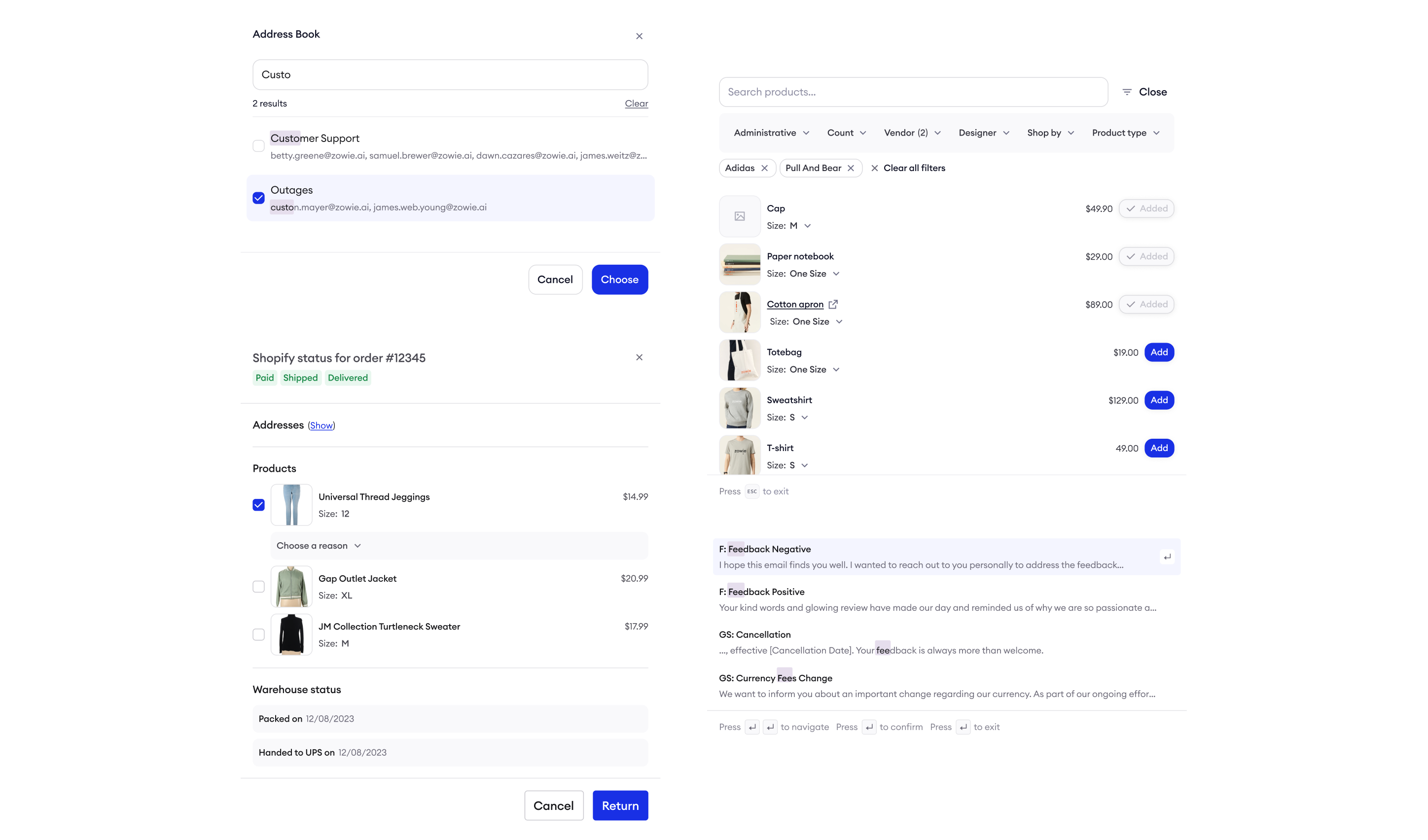
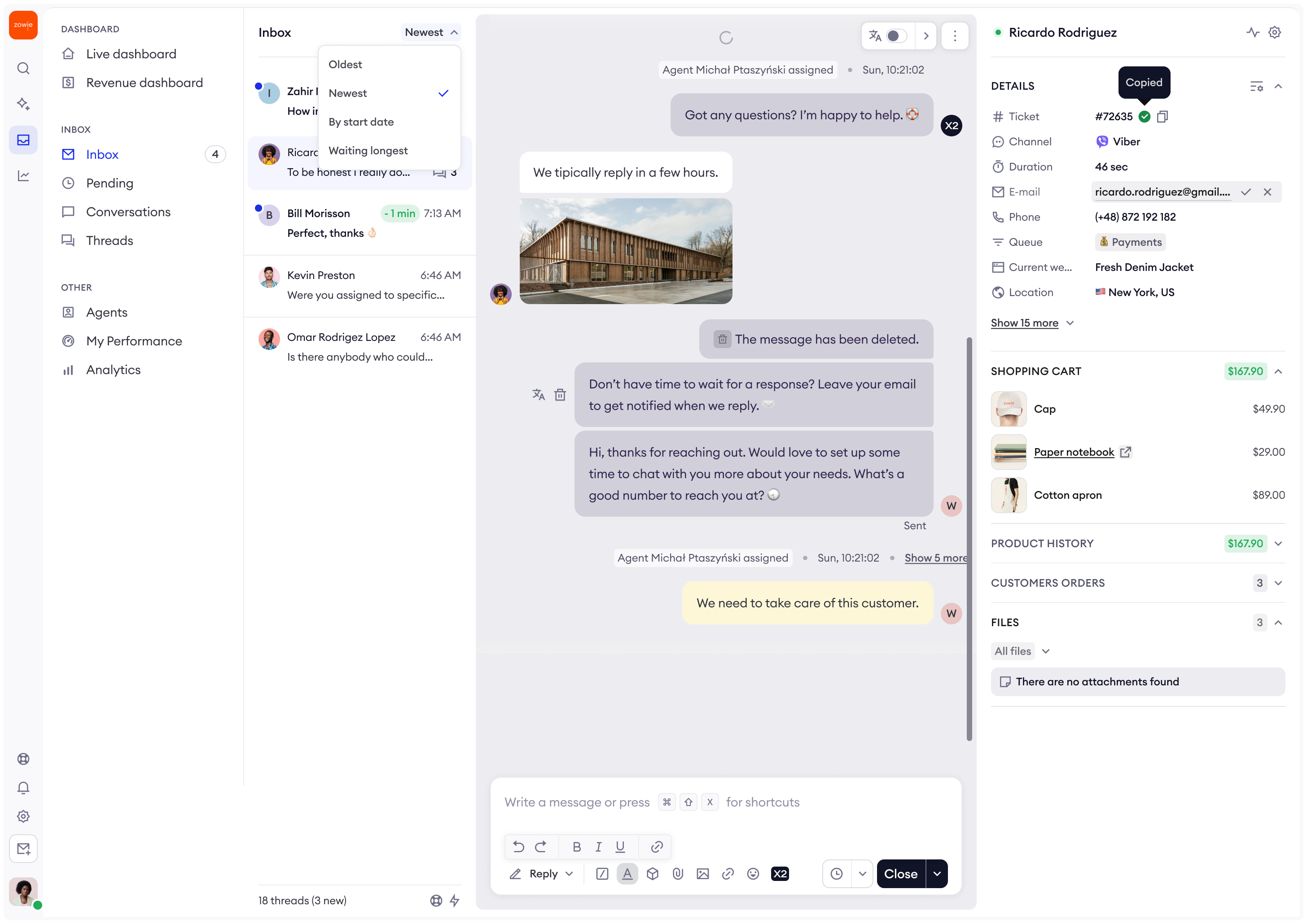
Inbox 2.0 is our most comprehensive yet Inbox redesign that overhauls the Inbox UI to make it look modern, less crowded and more fun to work with. The redesign includes a number of UX improvements.
As Lead Product Designer, I led the end-to-end redesign of Inbox — from discovery through delivery — owning design strategy, stakeholder alignment, and UX execution.
Problem
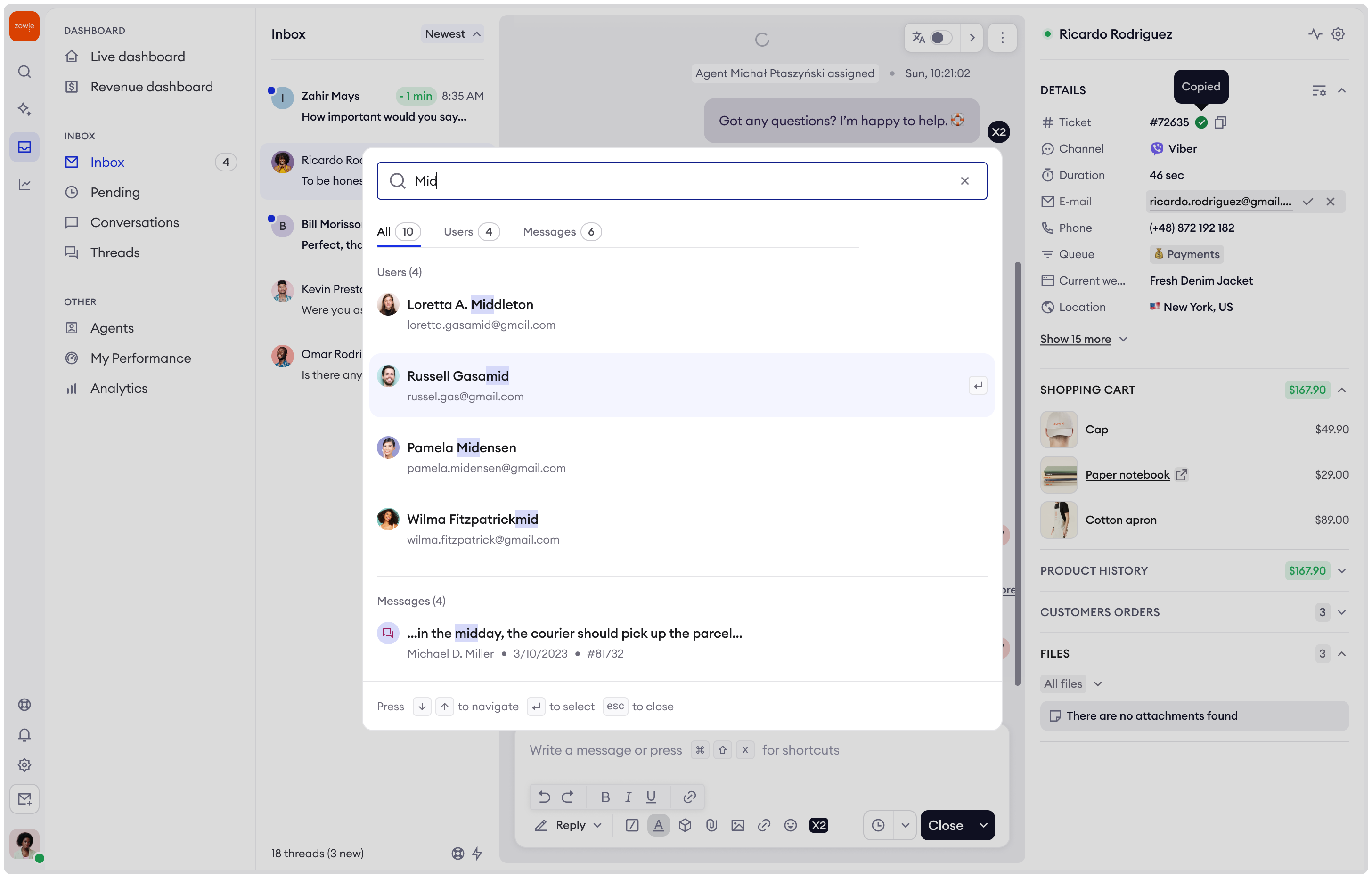
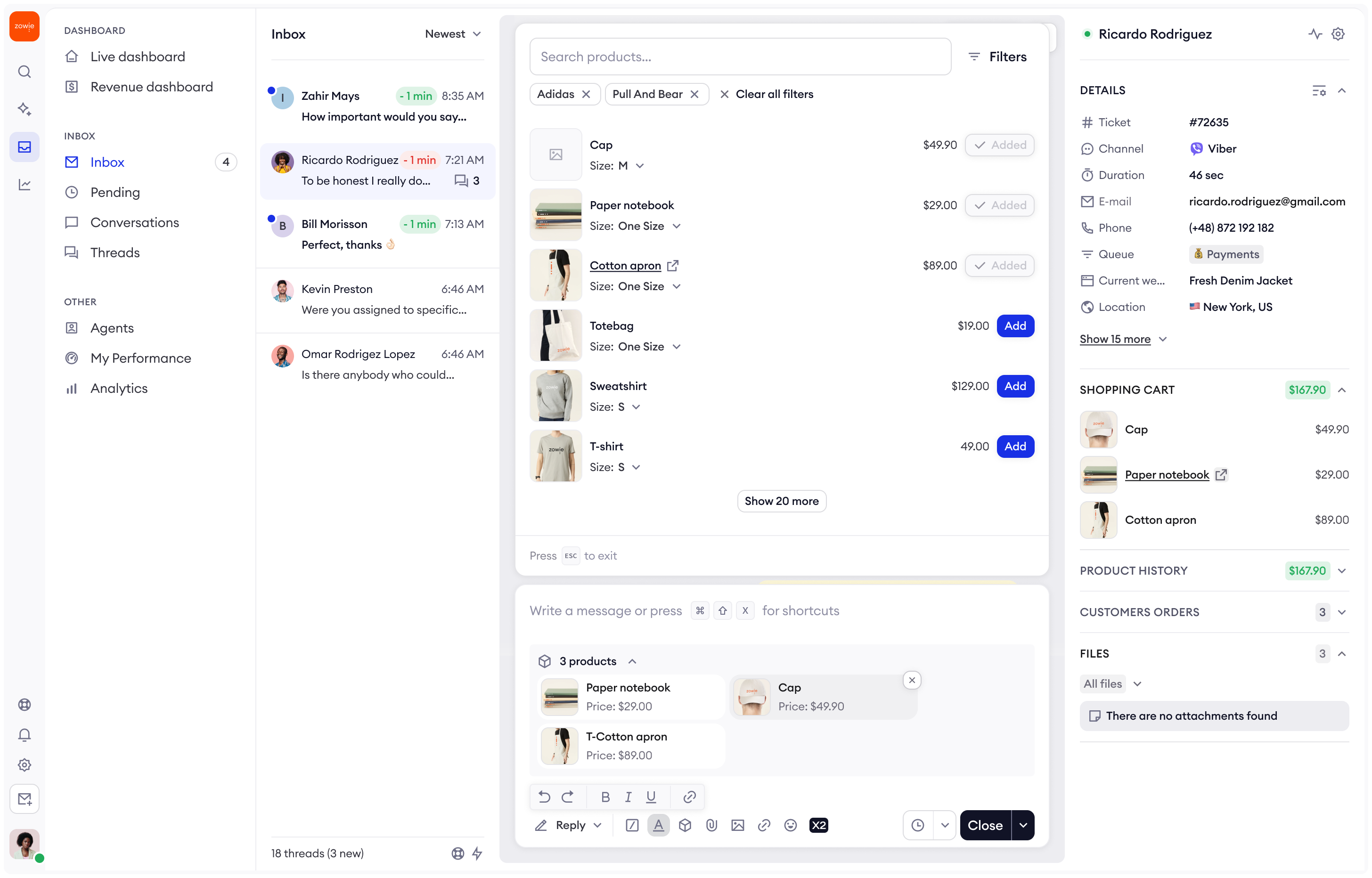
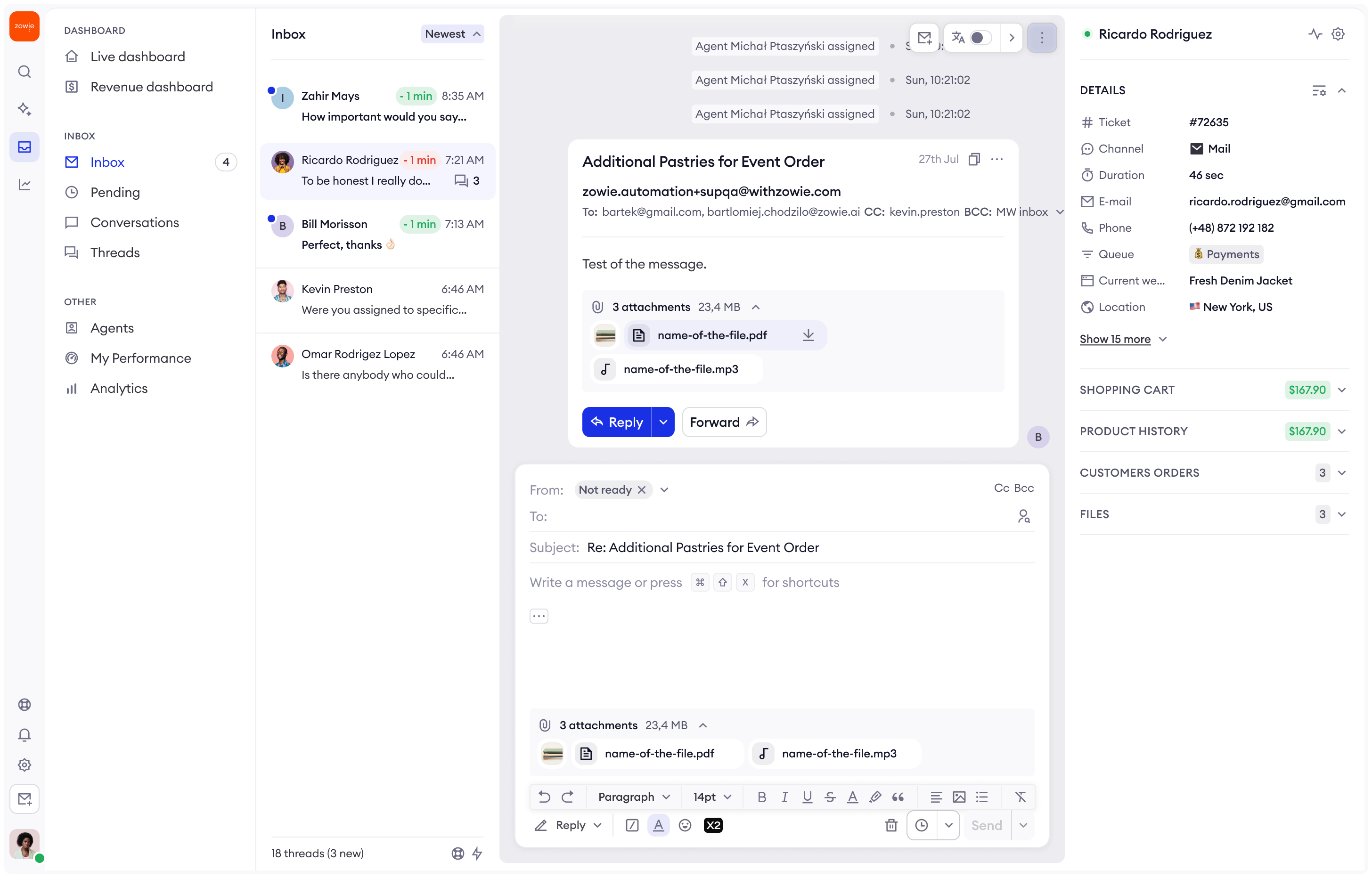
Inbox had two compounding issues I needed to untangle: 38% of users reported sluggish performance when navigating and closing tickets, while cluttered screens, limited message visibility, and inconsistent typography left agents working against the interface rather than with it.
Solution (What I did)
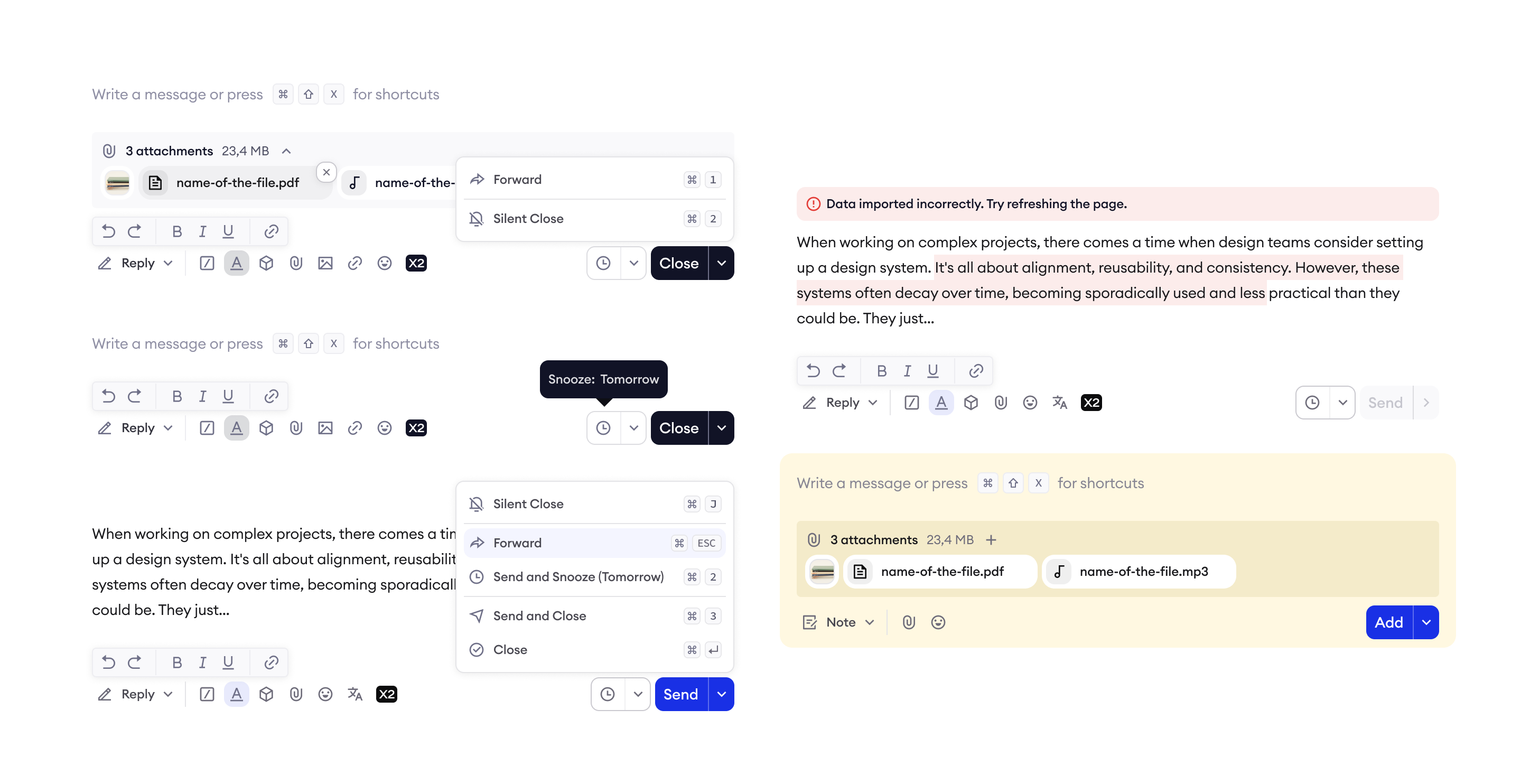
I ran stakeholder workshops and recurring customer feedback sessions to surface the real friction points, then translated those insights into Inbox 2.0 — a comprehensive redesign that resolved font and color inconsistencies, reduced clutter, improved message density, and introduced UX patterns that made efficient workflows feel natural rather than forced.
Impact
Shadowing sessions and follow-up interviews I conducted confirmed users found the new interface significantly more approachable and efficient — with keyboard shortcut adoption emerging organically as a signal of reduced cognitive load. The redesign established a clear performance benchmark: lifting Inbox satisfaction from 3.3 to a target of 4.5 out of 5, with a projected 2–3% reduction in handling time.